UAA logo do’s and don’ts
Do
- Use only the electronic logo files provided by University Marketing and Communications (UMAC). Never use logos copied off the internet from sites like Wikipedia.
- Scale the files proportionally.
- Keep all elements of the logo together as a unit, as provided.
- Maintain the minimum size standards.
- Use only UAA’s green and gold, or black, or white for logos.
- Keep the logo prominent.
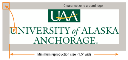
- Keep a comfortable clear space around logos for readability (see clearance area below).
- Make sure you have prior authorization to use the UAA seal or Athletics' Seawolf logo (request usage).
- Contact UMAC with questions about the proper use of the logo.
Don’t
- Try to recreate any of UAA's logos or tagline graphics.
- Add or alter names or type – new or modifications to existing logos need to be done by request.
- Stretch, squash or otherwise distort the logo or tagline graphics.
- Add or take away graphic elements, or use just a part of the logo unless it was provided to you in that way.
- Make the logo or tagline graphics too small (see sizing below).
- Change the colors of the logo.
- Put the logo over busy patterns, backgrounds or colors that obscure the readability of the logo.
- Don't use a UAA logo as part of a graphic element within another logo.
The examples shown here are just some of the “what NOT to do’s.” If in doubt, contact UMAC to make sure. Remember, if a usage seems wrong and you haven’t seen a UAA logo used that way before, it probably should not be used that way. Also, if you see a logo modified in a different way somewhere on campus, that does not mean it's OK or an authorized usage, and that others may do the same thing.
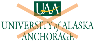
Do not distort original proportions.
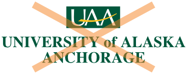
Do not substitute a different font for the wordmark.

Only use the authorized colors for any UAA logo, no substitutions.
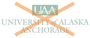
Do not screen or use UAA logos as a watermark.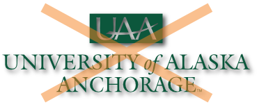
Avoid applying a drop shadow or stylized art effects/filters that could make the logo hard to read or reproduce poorly.

Do not contain logos within a white box or circle. Use a reverse version if placed over a background color or image.

Do not tile or use a UAA logo as a design pattern.

Do not use scanned, pixelated or low-resolution versions.

Do not rearrange, delete or add elements. Use only provided artwork.

Avoid using the UAA gold color only, even on a dark background.
Do not combine elements from different UAA logos.

Do not flip or rotate the Seawolf logo. Make sure you have authorized approval before using the Seawolf logo.
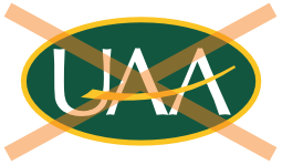
Do not place the monogram within shapes other than the authorized rectangle.
Safe clearance zone and size minimums
The clearance zone is an invisible space that surrounds the logo and needs to be incorporated with logos. To create maximum impact and legibility, logos require a specific clear space around all sides. Typography, other marks, folds and other elements should not cross the clearance zone. The space is measured roughly by the height of the first capital letter in the wordmark or a unit’s name.
If a logo is placed over a photo or graphic background, it should be positioned over a visually neutral area so it remains clearly visible and recognizable. Logos must always appear crisp, clear and easily readable.
Strive to keep the sizing of the different UAA logos at or above these minimum dimensions.
Unit logos clearance
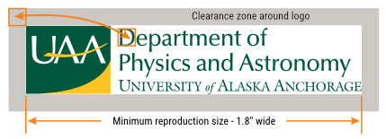 Base the width of unit logos on the distance between the left edge of the UAA monogram
box and the last "E" in the wordmark.
UAA primary logos clearance
